
Mark Rothko At 110
During the mid-1940s, a group of American artists developed a new artistic vocabulary and vision that made New York the center of the art world. These artists, known as the Abstract Expressionists or the New York School, all worked in a manner that emphasized abstraction rather than representational images. However, the Abstract Expressionists did not share a particular style. What they did share was a sense of individualism, rejecting certain concepts valued by earlier movements while embracing techniques and ideas from Cubism and Surrealism. One factor that seems to have been shared by all the artists was the importance placed on the act of painting itself. The Abstract Expressionists’ readings of psychology and anthropology inspired them to work in a manner that appeared accidental and spontaneous, but was actually the result of exhaustive experimentation with technique and process. This made the work of each artist highly distinguishable within the movement, in part because they often experimented with the same shapes and forms in very different ways. The paintings of Mark Rothko (born 110 years ago today, on September 25, 1903) are instantly recognizable; unlike the random gestures of the other artists in the movement, his work appears less spontaneous and more calculated.
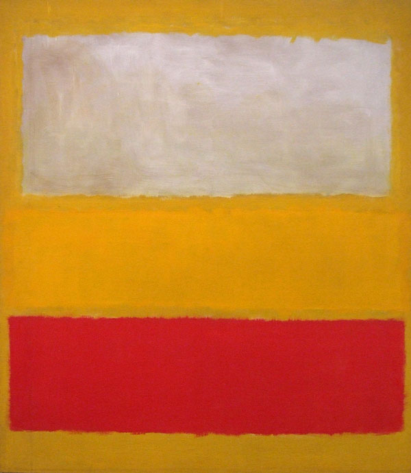
A signature style Rothko painting is No. 13 (White, Red, on Yellow) 1958, and its medium is oil on a large-scale canvas–measuring 95 3/8 by 81 3/8 inches. The painting is not framed, and the image is abstract and non-representational. The basic image consists of three horizontal bands of color that look like three rectangular shapes on the canvas. The ground of the image is a warm tone of yellow. On the surface, the brushstrokes are visible, and going in all directions. The bottom band is red and resembles a rectangle, except that its edges are soft and blurred. Within the red band, Rothko’s brushstroke is visible again, as is the yellow from the ground, bleeding through. The middle band is another soft rectangle with blurred edges. The color of the middle band is a different, cooler shade of yellow. The brushstroke is as gestural as the bottom band; also, in the middle, the yellow from the ground is still evident. The yellow band is smaller in width and longer than the red band. Since it is longer, the edges of the middle band almost reach the edges of the canvas. The topmost rectangular shape is white and, just like the other two bands, the edges are soft and blurred. The white band is wider and shorter than the other two bands. The brushstroke is again evident, but the color from the ground comes through even more strongly, making the white look translucent. The spaces between the bands appear equidistant, but because the bands are not strictly rectilinear, the soft edges create a sort of spontaneity to the painting.
Within Abstract Expressionism, Rothko was labeled a Color Field artist because of the large blocks of colors and the simple shapes. Also, his paintings did not look finished, and had a minimalist feel. The use of large-scale canvases, an idea that Abstract Expressionism took from the Mexican Muralists, combined with the painters’ own idea of working on unframed canvases to suggest a sense of continuity to their paintings. Rothko articulated his reasons for working at this scale in 1951, saying, “I paint very large pictures. I realize that historically the function of painting large pictures is painting something very grandiose and pompous. The reason I paint them, however—I think it applies to other painters I know—is precisely because I want to be very intimate and human. To paint a small picture is to place yourself outside your experience, to look upon and experience as a stereopticon view with a reducing glass. However you paint the larger pictures, you are in it. It isn’t something you command.” Because Rothko used warmer colors in his work, his bands of color had a propensity to come forward. Still, looking closely at the paintings, one can see that the artwork is carefully planned and calculated. This is particularly evident when it comes to the work of Color Field painters like Rothko or Barnett Newman. One factor that really takes over is the need of the artists to emphasize the qualities of the paint, or the act of painting itself. Looking at a formal analysis of Rothko’s paintings one can reflect on his sensibilities—first, the lack of rigor in his geometry, and second, how that geometry reveals itself to the viewer through prolonged looking.
—I.A. Freeman

I love Rothko’s work. I love how the colours, at first distinct blocks, seem to blend before your eyes, unveiling different tones and shades beneath the surface. I also disagree that his paintings are non-representational; he was definitely trying to represent the sort of liminal vistas he was seeing in his mind, and there’s something in it that I think most of us can also see – appreciation of his work is accessible to the average punter. It’s no surprise that his paintings are often described as windows onto landscapes: not explicitly defined, if that’s how one takes the term ‘representational’, but definitely representing something at the core of the human sensory experience.
I agree with you that abstraction is “representational” of something, i.e. emotions, nature, urban life, but when I made that statement it related only to a formal analysis of the work and not what it “means.” In seeking the meaning of a Rothko, I find the essay on his work in the Stephen Polcari book Abstract Expressionism and the Modern Experience to be deep and complex. Polcari sees Rothko’s art as a “modern version of the Greek ideas of tragedy. Seeing humanity at the mercy of the gods…” It is not necessarily tragic to Polcari, because Rothko sees the “sacredness of humanity.” Meaning doesn’t end there, either – some have suggested the theories of Carl Jung to get an understanding of Rothko. So you can see why I did not get into issues of meaning; too many views exist, and since abstraction is so subjective, it is almost impossible to cover all the angles on this subject. Thanks for reading! – Izalia